Amazon Mobile Optimization Guide: Increase Conversion Rates & Boost Sales on Amazon


News & Insights
You need a mobile-first approach when building your Amazon product listing pages. After all, nearly 70% of Amazon purchases occur on mobile, according to internal data across all our clients. Unfortunately, we often see brands neglect how their Amazon listings look on mobile. By not thinking mobile first, you risk having hard-to-read text, blurry images and a jumbled layout. And your Amazon A+ content and Amazon Brand Story feature, which have a more prominent position on mobile, may not look good. So, is your brand optimized for mobile? If not, don’t worry. We’ve put together this guide to show you all you need to know about Amazon mobile optimization. We’ll cover:
Read through and you’ll learn how mobile optimization can increase your Amazon conversion rates and sales. Watch our webinar: Optimizing Your Amazon Presence for Mobile
It’s always good to have a benchmark. So, let’s first answer the question: What is a good sales conversion rate on Amazon?The average Amazon conversion rate is around 10%, according to data from Helium10. That’s the average. At Amify, we believe a good conversion rate is around 15%, though that can vary by category and product. For instance, pet care products typically have a higher conversion rate than sports goods (source). An expensive heat tool may have a lower conversion rate than an affordable hair gel. As a seller, you have many ways to boost your Amazon sales and conversion rates. But one of the quickest ways is to optimize your presence on mobile. We’ll discuss why below. Read a case study: How we helped a bug bite balm achieve a 50% conversion rate!
What percent of Amazon users shop on mobile? If you do a Google search, you’ll find varying data on Amazon mobile versus desktop usage. Amazon doesn’t share this information, so what you find comes from different Amazon service providers and sellers. At Amify, we work with a lot of different sellers, from beauty and clothing companies to medicine and food brands. In the last quarter of 2020, 69.4% of our partner’s orders came from a mobile device, versus just 29.9% on desktop and 0.7% on tablet.
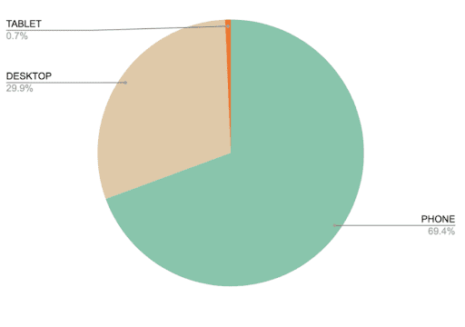
Nearly 70% of Amazon shoppers use a mobile device to buy products. That’s why you should focus on Amazon mobile optimization. “When we create listings, we do the copy and design from our desktops. It’s easy to forget that most of our consumers are on mobile devices when they’re shopping,” states Ally Manet, Associate Content Director at Amify. “Since 7 out of 10 Amazon shoppers view products from their smartphone, we must prioritize the mobile experience when building listings. If we don’t, we risk losing business.”
Here’s what an Amazon product listing on desktop looks like:
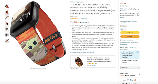
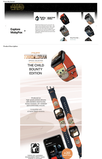
Compare that to an Amazon product listing on mobile:
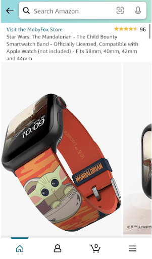
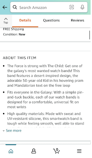
When building a listing, keep in mind how it will appear on both desktop and mobile. Obviously, you want to create the best listing possible, but you should give extra attention to the Title, Images, and A+ Content (as those matter most on mobile). Since shoppers see the first two bullets, and have to tap ‘see more’ to view the rest, your first two bullets should highlight the main benefits, features and selling points of the product. MobyFox Case Study: Read how we helped a watch band seller go from $0 to $30K per day in 90 days after Amazon launch. Hint: Amazon mobile optimization helped them boost sales.
When creating your Amazon listing, even the smallest tweaks can make the biggest difference. For your Title, Images, Product Attributes, Key Feature bullets, A+ Content and more, adhere to the following best practices and you should boost sales on Amazon.
Remember these do’s and don’ts for Amazon product titles:
Here are some good titles:

Here’s what you shouldn’t do with Amazon titles on mobile:
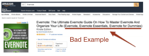
Look at how many times it says Evernote!
What works for one product title may not work for another. Note you may have an opportunity for A/B testing. So, test and optimize your titles if possible. Read about our A/B test on the best Amazon product title length.
Images get prioritized on Amazon mobile. Here are some guidelines you should follow:
“Images should be clean, clear and stacked nicely. You can use iconography, arrows and other sorts of callouts to help make content consumption easy. Images are a good way to show what you can’t tell, especially when you’re limited by the dimensions of a mobile device.” states Joe Wehrman, Art Director at Amify. On mobile, shoppers will swipe through your product images. So, you want to capture their attention with nice visuals that quickly show the value of your product. Avoid long lines of text and distractions in the images. Get to the point! To give you a better idea of what you should do, look at our in-house example images:

Product Attributes are automatically populated on Amazon based on product-level data. These attributes are designed to help with search and filter functionality, and can be managed via the listing dashboard.
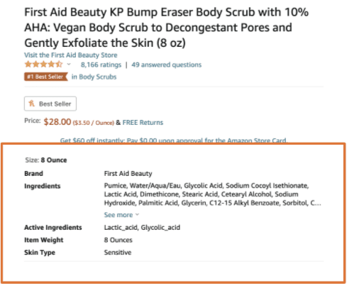
Ensure the data is correct!
Amazon bullet copy should clearly and concisely highlight the key benefits and features, while hitting important keywords. The following structure works well on mobile for convincing customers to make the purchase:
Your structure may be different. This isn’t a set structure. Use it as guidance to write your listing. The example below of a KP bump eraser body scrub is a helpful reference as well.

The first few bullets showcase the product benefits. The last few bullets address common customer concerns and provide evidence that it works as described.
A+ Content appears at the bottom of the page on desktop, but often at the top of the listing for mobile. So, think of mobile first. “A+ content is a playground. You have a lot of flexibility to show off your products, so it’s very valuable for Amazon mobile optimization. It’s also the space to display who you are as a brand. It can function like an extension of your website in some ways,” states Joe Wehrman.The best A+ Content visually stuns while showing off the benefits. This is how you drive conversions and boost Amazon sales. So, adhere to these best practices for A+ Content:
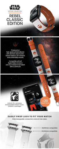
Text with imagery gets 94% more views than text without imagery. High-quality aesthetics along with concise product details will boost conversions!

A+ Content is not only great for displaying product benefits, but also for sharing info about your brand and company mission.
When it comes to Amazon mobile optimization best practices, A+ Content is one area you shouldn’t neglect. On average, A+ Content boosts conversion rates by 10%. Great A+ Content can boost Amazon conversions and sales even more. Read our Amazon A+ Content guide.
When building a listing on desktop, even small tweaks can impact appearance and performance on mobile. Keep these things in mind as you create your product listing:
2. Keep the title simple. Be straightforward with only the most important keywords to keep it from looking cluttered on mobile.3. Remember that there is only 1 version of A+ content, and it is a higher priority on mobile. It should be easily legible as it scales.4. Videos will play with audio muted by default, so use on-screen text to keep the viewer engaged.To ensure you boost Amazon sales as much as possible, here are some final do’s and don’ts for your Amazon mobile optimization:Do…
Don’t…
Following best practices for Amazon mobile optimization can lead to higher conversion rates and sales. It’s hard work to optimize each listing, but your efforts will pay off.As you’ve discovered by reading this article, there’s a lot to consider when you optimize a listing for mobile. Plus, Amazon continues to add and change features. For instance, they recently updated the Brand Story feature, and that section could now play a more prominent role in listing success (read our update Amazon Brand Story guide here). Since Amazon mobile optimization has its complexities and the rules and best practices constantly change, it helps to have Amazon experts on your side. At Amify, we not only stay updated on what Amazon is doing, but we consistently monitor and research what works and what doesn’t, and implement those strategies for our partner brands. If you need help optimizing for mobile, we’re ready to help you maximize your potential and sales on Amazon. Click the link below to get started.
Learn more about how we can help your Amazon business succeed!